Pink Coral Community.
The community had grown. Time for the branding to catch up.
Client: Pink Coral Community
Where are they: Hampshire and Surrey
How we helped: Brand refresh, logo suite, patterns, icons and typography
When we did it: 2025
Challenge
Nikki had built a growing networking community, but the DIY branding no longer reflected the business it had become. Pink Coral already had its own personality and a familiar colour palette. The task was to give that identity more consistency and confidence, while keeping the character people knew.
Approach
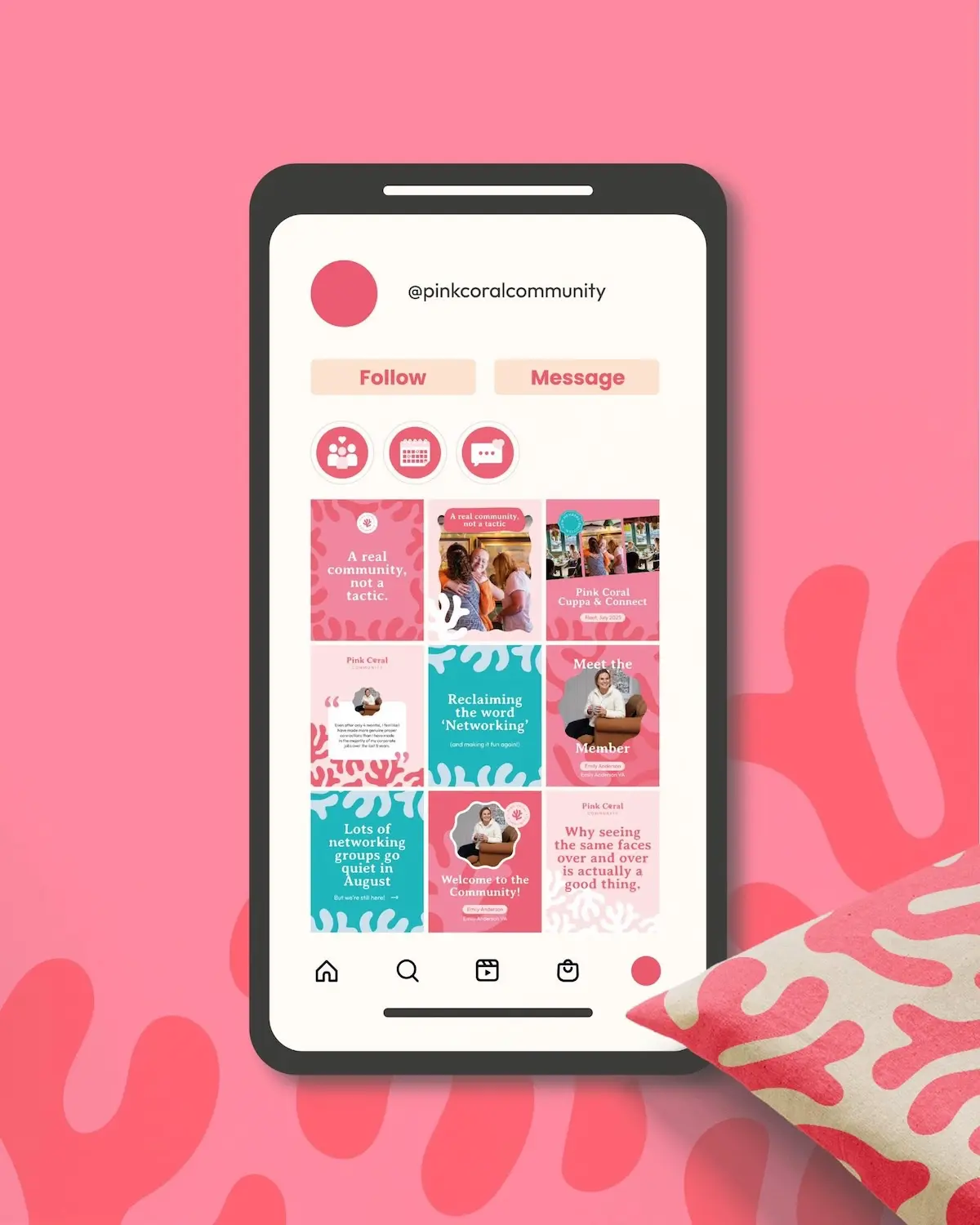
Lauren retained a similar colour palette and refreshed the logo suite, introduced distinctive patterns and icons, and established a consistent font library. These gave Pink Coral more to work with across its communications, with the different elements designed to feel part of the same family. A refresh with a clear purpose, rather than changing everything for the sake of it.
Solution
A more polished identity that still feels like Pink Coral. The refreshed elements bring consistency to the brand while leaving plenty of room for its warm, sociable personality. Nikki’s verdict was that Lauren understood the vision from the first conversation and nailed the brief. The business had moved forward. Now it looked like it.
Communication was super easy, everything felt clear and collaborative, and because she understood my vision so quickly, it wasn’t long before I had a brand that felt absolutely perfect.
Nikki Gibson
Pink Coral Community
Tell us about your project, and let's see where it goes.