

Sir Whippy.
A family business with years behind it. A fresh look with a flake on top.
Client: Sir Whippy
Where are they: Surrey, Hampshire and Berkshire
How we helped: Brand refresh, logo design, colour palette and typography
When we did it: 2026
Challenge
Sir Whippy brings ice cream vans to everything from weddings and workplaces to shows and the familiar streets on its rounds. The refresh needed to capture the fun of the business without losing what people already recognised. There was a starting point in the existing logo and van colours, with room to give the identity more personality.
Approach
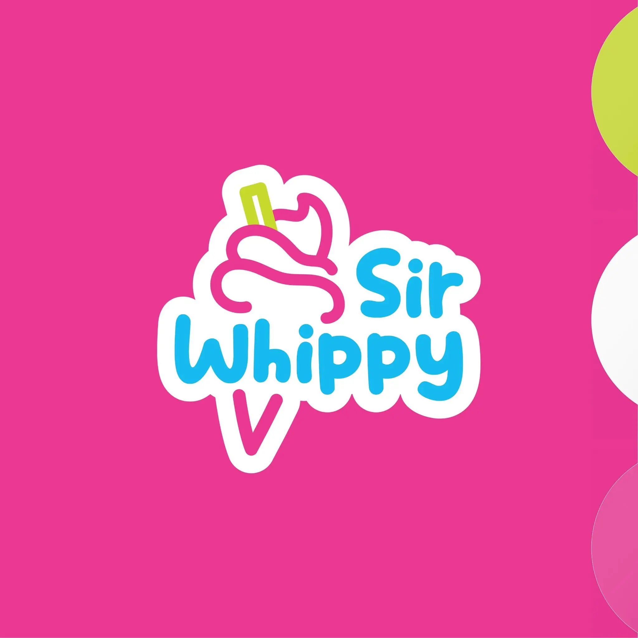
Lauren kept selected colours from the original branding and introduced a brighter, playful palette around them. A characterful typeface and a simple line drawing of a Whippy ice cream completed the logo. The result feels cheerful and unmistakably suited to the business, with enough simplicity to work well beyond the side of a van.
Solution
An identity that’s already finding its way into customers’ hands. Owner Andy has put the new logo to work on ice cream wafers and cup stickers, carrying the refreshed look through to the product itself. Familiar colours, fresh character and the small details considered. Even the wafer looks the part.
Tell us about your project, and let's see where it goes.